Machine Embroidery Needles 101
Understanding the differences between machine embroidery needles and knowing which needle to use for each project will go a long way in developing your skills as a proficient commercial embroiderer.
FULL STORY
(Editor’s Note: This article is the third in a four-part series on realistic designs. Click here to view Part 2, which covered digitizing realistic trees and bushes. Click here to view Part 1, which covered digitizing realistic landscapes.)
Note: This article will handle the basics of how to approach digitizing for animals. I use Wilcom as my primary digitizing program, so most of my specifications will focus on this software although Pulse can be used in a similar fashion.
We are going to look at this subject with a rather broad brush. The first thing is to determine how complicated you are going to make your animal design. Are there going to be a lot of thread colors? Do you want to tackle blends in areas? I find that the more thread colors you use in an animal’s fur, the more difficult it is to map out strategies. It looks better with more colors, but is more difficult. If you don’t have a lot of experience in digitizing creatively, I recommend you using just a main color, a highlight color and a shadow color when digitizing fur. Leave black and white for things like eyes and noses.
Since I started digitizing back when there were tablets and pucks involved, I like the idea of mapping out stitch direction. I try to follow this rule for stitch direction: vertical stitches look higher and horizontal stitches look flat. Remembering this rule, while keeping in mind that the foreground is closer than the background, is a good starting point. Background fill should be closer to horizontal stitching and foreground fill (the animal for our purposes) should be angled, near-vertical stitching. Now, consider how the fur lays and you should have an idea of how to map your stitch direction.
Fur
When dealing with fur, I like to make my own random pattern. In Wilcom, your default object properties for Tatami (ceeding or fill stitch) are a stitch length of 4 mm and an offset fraction of A: .25, B: .25, with a random of 0 (Figure 1). With short fur, try a length of 4 mm and offset fraction of A: .5, B: 0, with a random of 50 (Figure 2). For long fur, vary the stitch length between 4 mm and 6 mm, with an offset fraction of A: 1, B: 0 (Figure 3). This is a sharper delineation of a pattern, so the random pattern needs to be greater, about 70% to 90%.

Left: Offset fraction A: .25, B: .25. Right: Same offset fraction with random set at 50% and one jagged edge.

Left: Offset fraction A: .5; B: 0. Right: Same offset fraction with random set at 50% and one jagged edge.

Left: Offset fraction A: 1, B: 0. Right: Same offset fraction with random set at 50% and one jagged edge.
When using fill patterns, you may be used to creating an edge-run underlay to keep the fill sharp and clean. With fur, you want to do the exact opposite. You should let it be uneven; you may even want to use a jagged edge for a rougher look.
Another thing makes embroidered fur look real is strategic color order. If there are patches of fur that are darker due to shading, I prefer to embroider the darkest color first and then have the following colors get brighter or whiter in succession.
Stripes and Spots
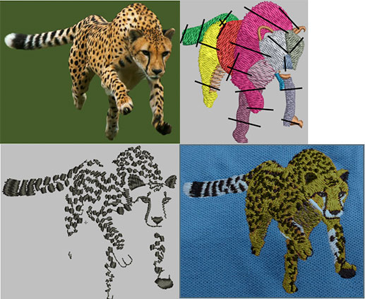
Remember that details like stripes or spots are still fur. The rules you have learned about proper underlay or keeping edges clean do not apply here. On the cheetah shown above, for example, I did not use any underlay for the spots.
When dealing with a lot of spots, such as on a cheetah, try to limit your trims to create roughness. You can do so by keeping your jumps in the same direction as the fill lays, thus eliminating a ton of trims. Your embroiderer will thank you.
Muzzles can be tricky. Try not to overthink them and also try to keep away from outlining shapes with satin stitches. This takes away from any illusion of realness. I generally like to simplify noses and since noses are most often the thing that is furthest in the foreground, I like to use a vertical satin stitch.
Birds
I’ve seen a lot of people digitize birds as one shape with a plain fill. This is the easiest way to do it, but definitely the least attractive. I like defining a bird’s individual feathers, if possible. If the bird is small and has many tiny feathers, feel free and simplify the feathers. Most people will not count and compare the number of feathers between the picture and the embroidery. If you do a bird that has 1 mm wide feathers and you are overlapping the feathers with 1.5 mm wide satin stiches, this becomes a lot of stitches in a small area. Too many stitches can cause the thread to break or fray and can often warp the area.
Stitch directions matter. Try angling the satin stitch to go the same direction as the barb of the feather. Also, vary the angle slightly from each adjacent feather to keep the stitches from feathering. An edge-run underlay will help too. Order is important when doing wings. If one feather is behind another, try keeping the order consistent. If a feather is supposed to be on top, don’t digitize it first.
As always, try things out and see what you prefer. Experiment with textures and angles and you will only get better.
Jesse Elliott is digitizing product manager of Artwork Source. For more information, visit artworksource.com.
Understanding the differences between machine embroidery needles and knowing which needle to use for each project will go a long way in developing your skills as a proficient commercial embroiderer.
FULL STORYWhether you’re running a small boutique embroidery shop or managing a large-scale decorated-apparel operation, attracting more customers to your business is crucial for growth and sustainability.
FULL STORY
There’s nothing more frustrating than being under pressure to get a job out and having something go wrong—and there are so many things that can go wrong!
FULL STORY