October 4, 2013
Throughout the years, we have taken part in many trade shows and conducted many seminars. We are asked a lot of questions when it comes to artwork and screen printing, but the most popular subject still is black shirts.
The allure of these shirts still amazes us. While everyone is immediately drawn to them, a lot of printers — not just beginners — fear them and immediately will decide there is no way they could print them. Well, we’re here to tell you, “Yes you can!” We’re going to shed a little light on the mystery of black shirts so that you, too, can start to create and print your own killer black shirts.
WHAT MAKES A GOOD DESIGN?
Why do black shirts usually impact us when we see them? People wear black shirts because the colors stand out or “pop” best on a black background. An image on a black background usually is the most stimulating. It’s all about the contrast and dramatic effect of the pop we see when looking at an outstanding print on a black garment.
Printing a full-color image on a dark shirt is perceived as one of the hardest techniques a screen printer must perform. While printing images on dark shirts may be more difficult than printing on whites, the results are amazing and are worth the time and effort. Printing detailed, photorealistic images and illustrations on dark shirts always has been the goal and caveat for many garment screen printers. To have a successful print, you must understand what it takes to create a good black shirt design.
When creating a design to print on a black shirt, remember to take advantage of the shirt color. Incorporate a lot of black and dark shaded areas, which will give the shirt a softer feel when printed. Since you won’t need to print black ink on a black shirt, those areas will strictly be the garment color showing through. Any dark, shaded areas will have little to no base white, so the overall design will be softer, lighter and more comfortable to wear.
You’ll also notice that a good black shirt design is high in contrast, with heavy black areas and strong highlight areas. This high contrast is very dramatic, which aids in the “wow” factor of the layout. When designing your layout, consider one major “light” source. Let it come mainly from one direction so that one side will capture the strong white highlights while the other side will be heavily shadowed. This will help the design pop off the shirt while blending in at the same time, with the shirt working as the shadowed area.
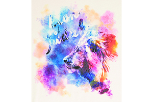
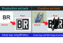
The tiger we originally worked with was an image we wanted to turn into a black shirt. While it’s a beautiful illustration on its own, we wanted it to have more pop, especially for a black shirt. After using the techniques mentioned above, you can see how it was transformed into the tiger image shown at the top right. This new image has much more interest and will use the darkness of the shirt to its advantage.
You’ll also sometimes find subtle background elements in black shirt designs. These elements will be shaded in darker colors so that when printed, they fade into the background. They create added interest without competing with the main element, which, in turn, creates added depth and makes the main image pop that much more.
THE INTIMIDATION FACTOR
You’ll typically find that good black shirt designs are created using halftones. It’s these halftones and the gradual shading of colors that help produce the soft-handed feel. Designs created using solid areas of color not only have no wow factor, but the print itself will be thick and heavy because of the two layers of solid color (the ink color and the base white).
It’s the need to print halftones that often scares people away from printing black shirts. They feel it’s too hard and they don’t have the capability. The only difference between success and failure when it comes to printing black shirts is the ability to print a halftone. If you can print a controlled halftone dot, you can do this.
The designs you see in this article were separated using the simulated process color method. This is where an image is broken down into a series of individual spot colors and reproduced using halftones. This process allows you to print specific spot colors using opaque plastisol ink, which will show up well on the shirt. True four-color process separations require the use of process color inks, which are transparent, making it difficult for them to show up on a black shirt. Thus, it is more difficult to print an image that pops off the shirt.
You’ll also find that when using simulated process separations and halftones, printing is easier than with vector art, and is much more forgiving when it comes to registration. With vector art, you need to make sure things line up exactly to prevent any gaps from showing. Or, in the case of black shirts, you don’t want any base white from peaking out from under a color along the edges. With this process if an image is slightly out of register, it’s less noticeable.
Halftones really are just a series of small dots lined up in rows within a linear inch. The number of dots in that linear inch equates to the “frequency” or line screen. As long as you have a printer and RIP software that will produce a proper sized dot required for screen printing, you can print designs using halftones.
Three things you’ll have to know to set up a halftone screen are frequency (lpi), screen angle and shape. You will use the same frequency, screen angle and dot shape for all the colors that you print, including the base white.
PRINTING TIPS
Now that we’ve given you some insight into how to create an image that will work well on a black shirt, here are some tips on how to print it. We agree that this is a “Garbage in, garbage out” business. Remember that starting with bad art will never result in great printing.
There are exceptions to every rule and, as an industry, we are learning more and more about mesh geometry. There are many methods to achieve a solid result. Based on the aforementioned halftone recommendations and for printing on a manual press, use the following mesh counts: 156 tpi (threads per inch) at 30-35 N/cm 2 for the white printer or underlay and 230 tpi at similar tension for all other colors, including highlight white — all with a standard thread diameter.
For automatics, additional detail and smoother transition areas, we may employ some thin thread technology or high-tension methods. We would only flash and cool after the white printer. For the balance, try printing wet on wet. We rely on the colors blending to give us those transitions and the dimensional look.
Proper stencil preparation is critical. The best stencil for halftone reproduction is a quality dual-cure emulsion. Though there are always exceptions, it typically has more latitude and is more forgiving than one-part photopolymer emulsions, which have a very fast exposure time.
The proper stencil thickness also is important. Add that and the mesh thickness, and it has much to do with ink deposit. Exposure and development of the stencil will dictate the halftones we can and cannot hold on screen. We run exposure tests continually to identify which halftone levels are reproduced.
When printing on a manual press, use sharp 70 durometer squeegees with as little pressure as possible to keep most of the ink on the surface of the shirt. For an automatic, use 65/95/65 or 75/95/75 triple-ply dual durometer squeegees set at a 15- to 20-degree angle with minimal pressure and a fairly quick stroke speed. Floods are used to fill the stencil with adequate speed and pressures.
After initial registration, you need to do several strike-offs before getting close to accurate. After several prints, subsequent shirts’ colors should begin to look stronger and stronger until they level out. The colors shouldn’t change throughout the run until screens are wiped and the strike-off process may have to start over.
The white printer or underbase probably is one of the most critical plates used on black shirts from a quality and productivity perspective. Pay particular attention to the white printer. You can get a gut feeling about the final print simply by evaluating the first white that is laid down and whether it does its job by emphasizing shadow and highlight areas.
Another overlooked piece of the process is the substrate itself. The smoother and tighter the weave of the garment, the better. A smoother substrate ultimately will generate a smoother final print. A solid substrate and a good white printer build the foundation for the killer black shirts you are aiming to create.
Dane Clement is well-known for his expertise in computer graphics and color separations. He is the president of Great Dane Graphics (a GroupeSTAHL company), has authored “T-Shirt Artwork Simplified” books for Adobe and Corel users, and is now vice president of Creative at GroupeSTAHL. For more information, visit greatdanegraphics.com or contact Dane at dane@greatdanegraphics.com.
Lon Winters, is president of Colorado-based Print This Inc./Graphic Elephants.com, an international consulting firm specializing in technical advances, plant design, layout, troubleshooting, productivity, quality analysis and complete garment-embellishing solutions. For more information, visit graphicelephants.com or contact Lon at lonwinters@aol.com.
April 27, 2023 | Graphics + Design
When it comes to creating a design layout for a hat, hoodie or T-shirt, there are some basic concepts it’s important to keep in mind to create a design that’s pleasing to the eye, catches your attention and draws you in. One of these concepts is focal point.
FULL STORY
May 18, 2022 | Graphics + Design
According to Erik Cartmill, president of Cornerstone Impressions, Fort Worth, Texas, his business operates on the following philosophy: “Where there’s a Bill, there’s a way.”
FULL STORY
March 3, 2022 | Graphics + Design
“But I’m not an artist!” the screen printer said on the phone for the second time. He had agreed to do some work for his best customer, with a last-minute request for artwork help.
FULL STORY